Reducing Call Centre Overload by Enhancing the Contact Us Page
P&O Cruises, one of the oldest cruise liners in the world. Faced some challenges with users overloading their customer service centres due to not fully utilising self-service options on their Contact Us page. This cause long waiting cues and frustration to users who needed to make enquiries. We were engaged to enhance their website through CRO experimentation with the aim reduce call volumes and improve user engagement on their contact us page.
UX/UI Designer, CRO & Experimentation
Travel
2 concept variations for mobile and desktop screens
2 months

The Approach
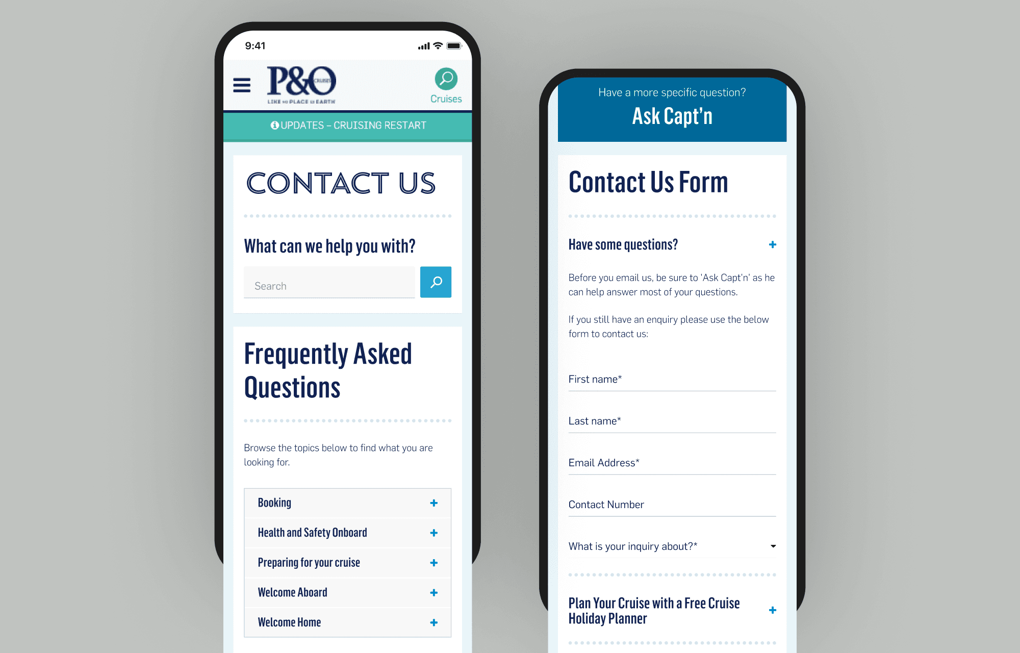
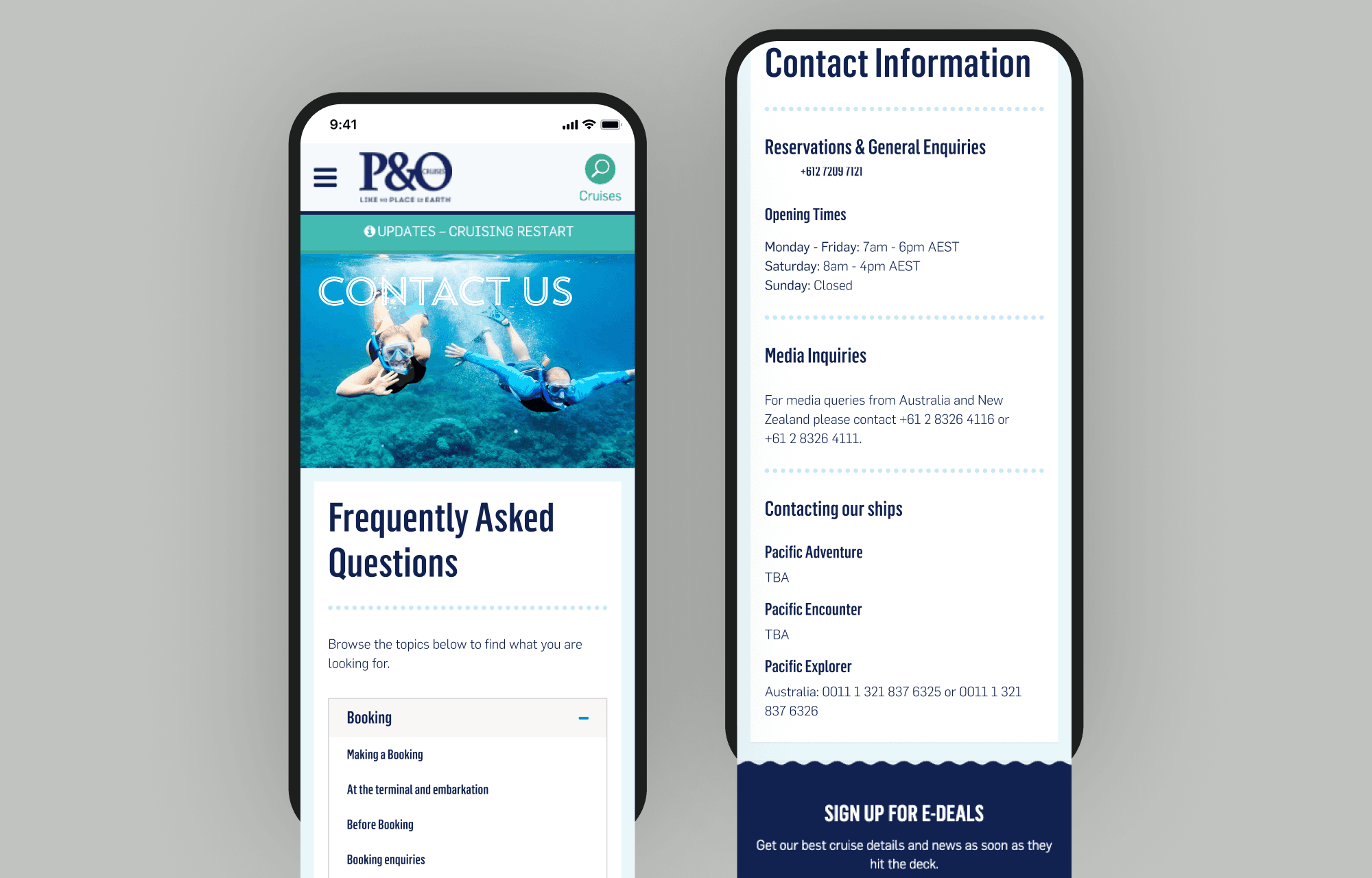
To address the problem, we created user personas, identified as "The Enquirers" who needed assistance but struggled to find answers on the main website. We hypothesised that rearranging the choice architecture on the Contact Us page to prioritise non-call centre options would lead to more users engaging with alternative contact methods.


Our design phase involved creating two concepts and presenting them to the client. Concept 2 was chosen for further development and we implemented the design using Optimizely for an A/B test, distributing 50% of the traffic to the new concept across both mobile and desktop devices.

3,586%
FAQ interactions on mobile
29%
Chatbot interactions on mobile
141%
Alternative clicks on mobile
Test and Learn
In our experiment, we found that 59% of desktop users preferred Concept 2 over the control version, resulting in a 22% reduction in call centre volume. FAQ interaction increased by 537%, and chat bot usage rose by 12%. On mobile devices, 141% more users preferred the new contact page, with FAQ interactions increasing by an incredible 3586% and chat bot usage increased by 29%. Additionally, mobile users' clicks on the call centre number decreased by 10%.
Overall, the new design received more engagement, and the exit rate consistently outperformed the control version across devices. Our results indicate that many users were able to find their answers through the FAQ and chat bot before resorting to calling the company directly.


By prioritising self-service options on the Contact Us page, we aligned user behaviour with P&O Cruises business objectives, reducing their call volumes for more urgent enquires and driving better user experience overall. The significant improvements in our engagement metrics validated our hypothesis and illustrate the value of understanding and addressing user pain points through the lens of their cognitive bias. This demonstrates how strategic design thinking and testing can drive meaningful business results.

Other projects
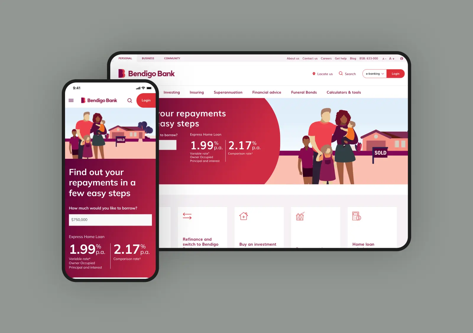
Bendigo Bank: A home loan journey that starts with “what can I afford?”
Using cognitive biases and a clear, supportive tool to help users understand their position. Then helping them take the next step.
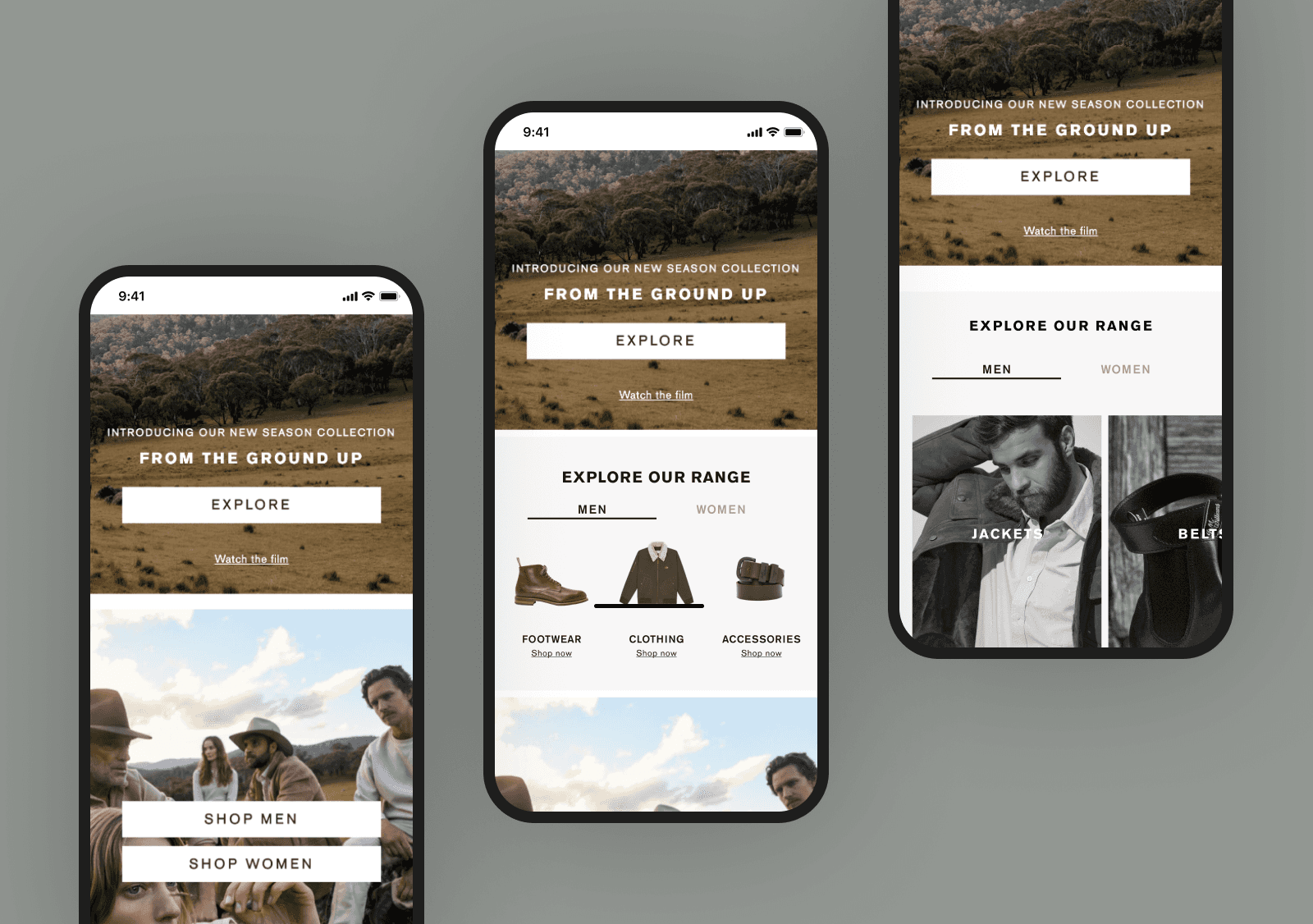
R.M. Williams: Guiding curiosity through a quiet redesign
Persona-driven choice architecture that helped 124k monthly users discover what they didn’t know they were looking for.