Building a Unified Lending Platform for NAB
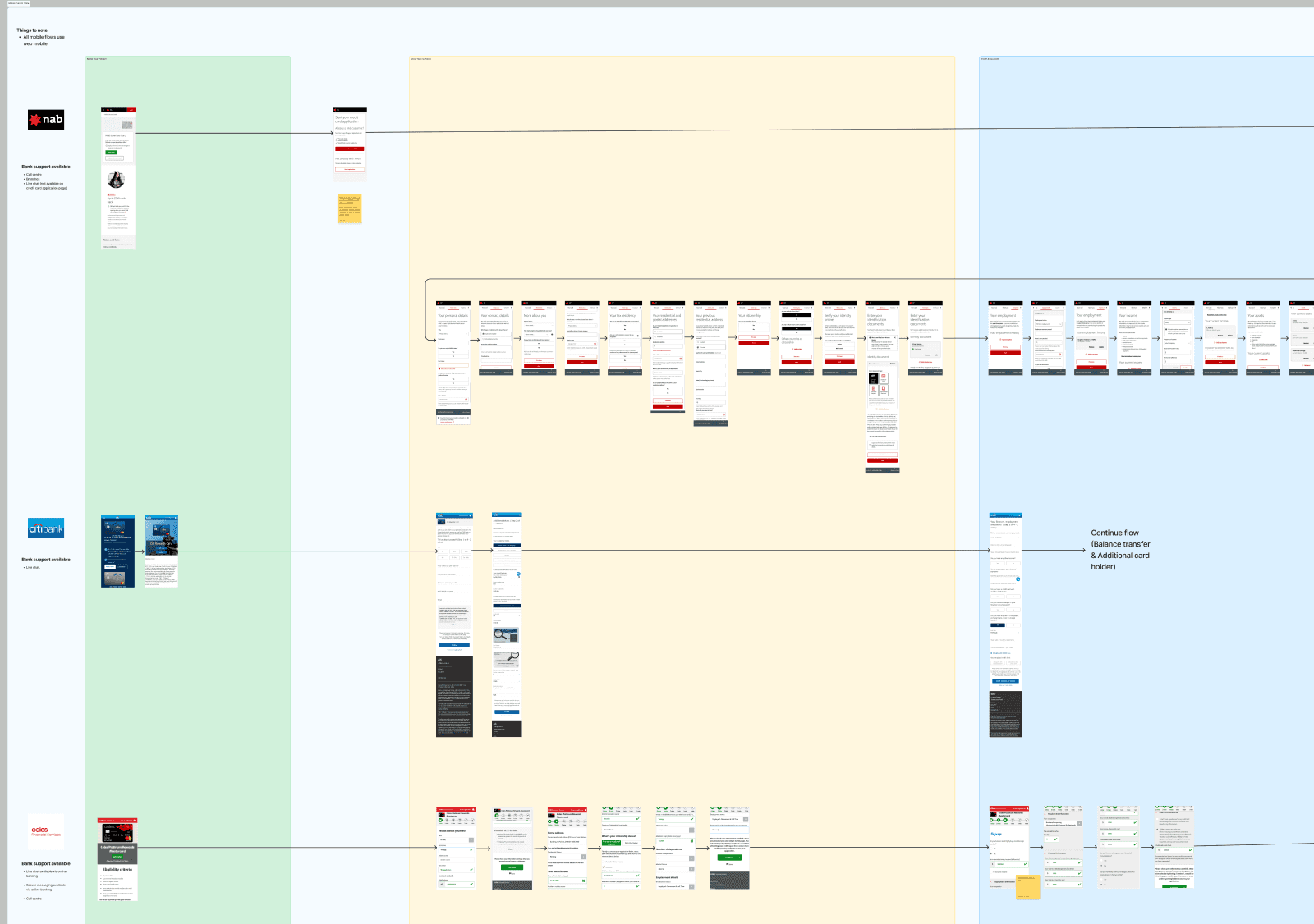
When NAB acquired Citigroup's Australian consumer business in June 2022, they inherited a fragmented landscape of apps and web experiences that needed to become one. The challenge was about making that transition feel invisible to customers.
I was brought in through Deloitte Digital as part of the "Apply and Setup" squad, focused on onboarding UX and ensuring migrating Citi customers landed in a product that felt cohesive, intuitive, and distinctly NAB.
UX Research, Product Design
Consumer Finance
MVP pilot app and responsive website
1.6 years

The Challenge
Consolidating multiple apps and web experiences into a single platform, without disrupting existing NAB customers or alienating the incoming Citi base. The platform also needed to be white-label ready, scalable, and aligned to NAB's existing design system.

The Approach
I led heuristic evaluations and friction analysis across NAB's current onboarding flows to identify where customers were dropping off or hitting walls. From there, the team ran weekly customer interviews, usability testing, A/B testing, and card sorting exercises to continuously validate and refine our design decisions.
To tackle the technical complexity, I facilitated workshops with engineering teams — bridging the gap between design intent and implementation reality, and making the case for UX improvements where there was pushback.
We also established a weekly research newsletter to keep stakeholders across the programme informed and aligned, which became a key tool for maintaining momentum and buy-in.


The Outcome
The results spoke to both the user and business impact:
94% customer satisfaction — up from a silver to a platinum rating
30% reduction in support tickets related to migration errors
100+ features delivered with production ready UI across pilot and future releases
25% reduction in platform maintenance costs through consolidation
Designs for pilot releases 1 and 2, plus documented recommendations for future iterations based on user feedback

The key takeaway from this project wasn't just the output, it was learning how to move fast in a high-stakes environment without sacrificing the quality of thinking. Weekly testing cycles kept us honest, and close collaboration with both business stakeholders and engineering meant our designs actually shipped.
Other projects

Bendigo Bank: Empowering users in their Home Loan journey
Streamlined the home loan page with a repayment calculator, boosting user engagement and inquiries.
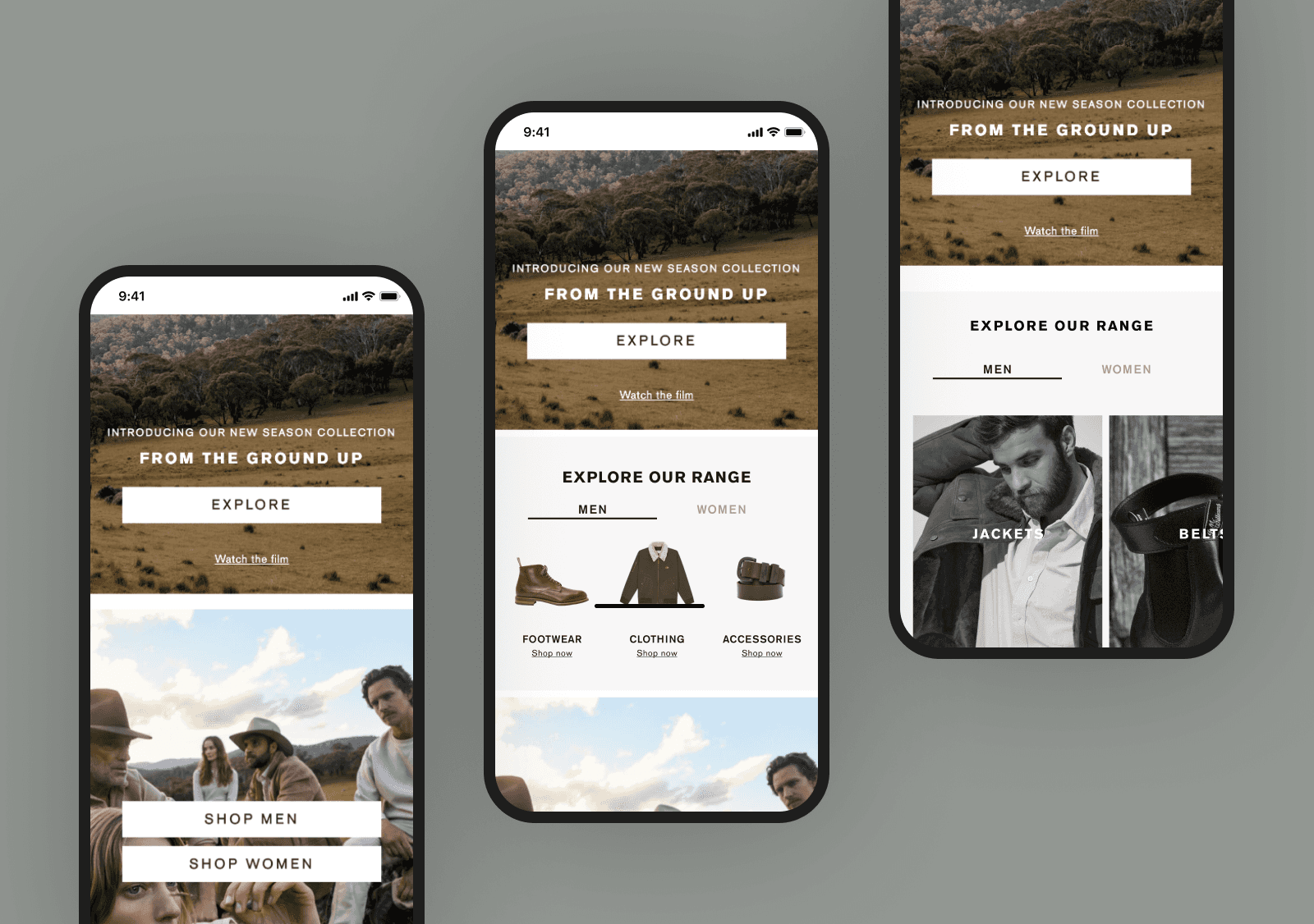
R.M. Williams: Enhancing product discovery on the homepage
Redesigned the contact us page to prioritize FAQs and chat bot, cutting call center volumes and improving user interactions.